How To Optimize Your Ecommerce Checkout Flow
Cart abandonment is on the rise. According to recent statistics from Baymard Institute, the average cart abandonment rate is at 69.57%.
Bad news first: the majority of cart abandonments are unavoidable. Most online shopping activities revolve around exploring the options, making price comparisons, and saving items for later.
Baymard Institute sheds some light on some of the reasons why US shoppers have abandoned a cart in the recent past. Specifically, 58.6% of those surveyed said they were “just browsing” or “not ready” to buy.
But even factoring out the unavoidable shows that there’s still a lot you can do to improve your ecommerce checkout rate.
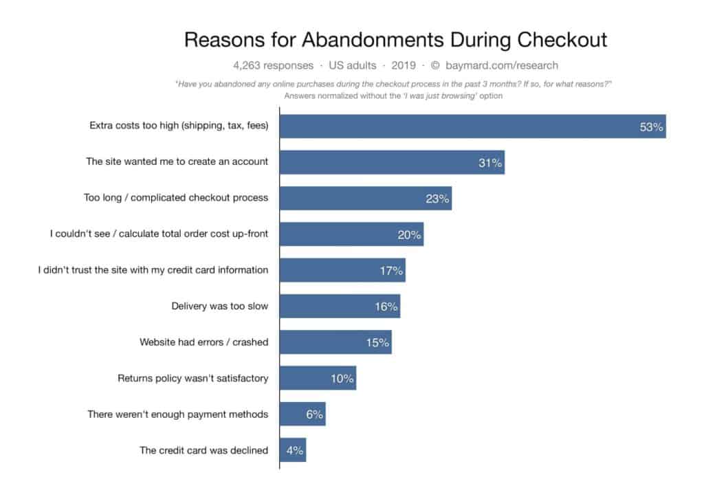
Here are a few more insights into why people abandon their carts during checkout:
While you can’t convert every customer who adds products to a cart on your ecommerce store, you can certainly turn the tides in your favor by optimizing your ecommerce checkout flow.
Here’s how:
#1: Keep it Simple with One Call to Action (Checkout)
Once the customer is in the checkout area, your only objective should be to see them complete the process.
Other calls to action on the page, no matter how subtle they might be, are just competing with the conversion. Distractions and unnecessary information make it easy to exit. So what should you do?
Focus on getting customers to get to the confirmation page as quickly as possible. The more they hesitate or are distracted, the lower your chances of getting them through to the “Thank You” page.
When designing your checkout page, determine what details you absolutely need from the customer. Usually, these will be personal details, address, and payment information. Depending on your store, you might also need to allow for entering in gift card details or promo codes.
In general, aim to keep things minimal and ask only for the information you need.
Using a one-page checkout tool, savvy retailers can design their checkout process to fit within a single page. This improves the checkout flow, reduces the amount of time to check out, and increases the conversion rate.
Using the Quick Checkout extension for WooCommerce, shoppers can make one-click purchases, check out directly from a landing page, and skip some steps — shortening the process.
When designing your ecommerce checkout flow, it’s best not to beat around the bush with distracting information.
#2: Don’t Force User Registration for Checkout
In the interest of making the checkout process smoother and faster, don’t make the mistake of forcing your buyers to create a user account (register) before checkout.
Understandably, as the business owner, you want to gather customers’ data so you can use it to provide better services and more relevant products. However, the customer sees it differently: They are there to buy, not necessarily start building a relationship with you.
Requiring them to register before they can complete a purchase seems pointless at best and a colossal waste of time at worst. In-between, it’s an inconvenience that hinders the process.
The smart move is to let users check out as a guest. This means that you only require their email and other personal details required to process the transaction. If the customer doesn’t want to create an account, make sure that you aren’t using this email to send them promotional messages or get their feedback on how to improve your store.
For a first-time customer, this is the most convenient way to checkout. It requires less commitment, takes less time, and is less intrusive than creating an account.
For better results, let the user check out first before you attempt to ask them to register. If they had a great experience, chances are they will. And if they don’t, at least you didn’t lose the sale.
#3: Establish Trust Throughout the Checkout Process
Online shoppers are right to be concerned about their safety.
The type of data required of them — be it PII (Personally Identifiable Information) or payment information — is best shared with trustworthy businesses. Displaying trust signals throughout the process makes them confident that they are shopping at a safe store.
So how do you show them that you can be trusted?
Here are a few ideas:
- Use HTTPS on your site. This shows the user that communication between the browser and web server is secure and cannot be intercepted by third parties. If you haven’t updated your site by now you’re not only turning customers away but also losing your place on the SERPs (search engine results pages).
- Provide effective customer service. This includes offering help in a timely manner and clearly displaying your terms of service.
- Display payment options. For instance, showing badges that say things like “verified by Visa” associates your brand with another one that your customers trust.
- Show off business accreditations. Tell customers about any milestones you’ve reached in improving the security of your store.
#4: Get the Customer’s Email Address
So you’re not forcing registration and you can only use the email entered by guests for sharing order updates. That doesn’t mean you shouldn’t otherwise attempt to get customer emails.
Having access to email allows you to follow up with a prospect when they abandon a cart. You can get some of these users back by sending abandoned cart emails, reminding people about what they left in the cart and enticing them to come back to complete the purchase.
According to BigCommerce, some brands have increased their revenue from eight to 20 percent by the simple act of sending abandoned cart emails.
Using an email service provider such as MailChimp, Infusionsoft, AWeber, or ConvertKit, you can set emails to automatically deliver based on certain triggers. A well-optimized abandoned email campaign can significantly increase your conversion rate.
#5: Properly Display Shopping Cart Contents
Your checkout page design is crucial to improving your conversion rate. An ugly and cluttered shopping cart is likely to turn customers off and hurt your conversions.
What does a good cart design look like?
It’s not complicated and distracting with unnecessary information.
The customer needs to know what’s inside the cart, the cost, and the total amount they’re being charged — including shipping fees and taxes. The cart should also allow the shopper to easily add or remove items.
Some carts let users save items for later when they can’t buy at the moment. At the payment stage, make sure that their cart contents is clearly displayed.
Have a clear call to action (CTA) pushing the buyer to check out and remember, this should be the only CTA.
To optimize your cart, use compelling images and highlight any incentives, such as a return policy, money-back guarantee, or free shipping.
Final Thoughts: How to Optimize your Ecommerce Checkout Flow
Optimizing your ecommerce checkout flow is an excellent opportunity to improve your customer satisfaction. Aim to provide a great experience for your buyers and the conversions will come.
Improve your odds when it comes to increasing your conversion rate by optimizing around one page checkout, using a WooCommerce extension like Quick Checkout.